WONDR has always been internationalist in its approach to digital products, hiring staff, and in its outlook – absorbing and drawing inspiration from the best from international design to constantly feed our cultural curiosity.
There’s a lot of synergy between the Catalan people and the Irish people, and as it happens, between Catalonia and WONDR. So we are delighted to be working closely with 11Onze on their launch.
It marks another stage in our development as we deliver a high-profile product into the Catalan region and beyond. Our vision is to work on a series of digital products across the globe from Dublin, whilst providing on the ground team members to support. In doing so we hope to spread our ethos of ‘innovation through clarity and bravery’.
Delivering digital products in beautiful Barcelona allows us to attract an even greater pool of talent & clients.
Dermot OShea FounderGoing beyond Ireland will also perpetually reinvigorate what we do here in Dublin, where we continue to design meaningful products and exceptional digital experiences (dismantling needless complexity as we go).
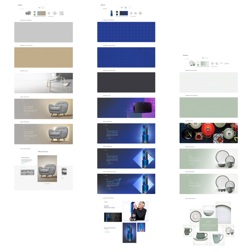
Arnotts are a well known Irish brand who have been around for a long time but with a little help from ourselves at WONDR, they have significantly increased their online revenue while transitioning to a new e-commerce system.
While many e-commerce projects focus on the system, we as a team also spent a significant amount of time focused on the role that the brand needed to play. Our Director of Creative Brand Strategy, Oisín Hurst, reflected on what it took to revamp the brand through the new ‘Salesforce E-Commerce Cloud’ platform.
Where did you start?
From a creative standpoint, working into a system like Salesforce E-Commerce Cloud is an interesting challenge. It’s a beast of system. It’s very established, robust and complex. It’s serious stuff. So one of the first things we did was to look for benchmark examples.
To see what brands and websites that had taken this technology, this platform, and created truly exceptional, branded experiences. That was our aspiration for ourselves and for Arnotts. So as a starting point yeah, benchmarking seemed to make sense.
‘Seemed to’ sounds like it didn’t pan out.
Well, it did and it didn’t. What we found was very few brands were achieving anything remarkable. Instead the platform was constricting them creatively. They were system shells. Pure merchandising and little else. The brands, even luxury ones, just poured in imagery, type and colour. It’s a little bit daunting to be honest.
When you see famous brands fall into this trap it certainly gives you pause for thought. Like, if it’s good enough for these big guys…
Why isn’t it good enough? Is it really an issue given Arnotts is a retail brand?
Absolutely. Firstly, a brand should never feel like a passenger on its own website. Premium retail experiences should have depth, not a veneer of brand presence. The UX, UI and underlying technologies need to lean into each other. From a UI perspective, the brand needs to be part of the website’s DNA, it should be a part of the building blocks, not just the paint at the end.
Also, unlike the examples we were finding, we couldn’t rely on seasonal campaign assets to do all the heavy lifting. Instead we needed to have a scaleable branding asset. Something that could work as a building block and extend into a full and rich design language. But it had to be very flexible.
It had to work during sales and promotions, integrate with imagery, act as a texture, be a box, be a pattern, be loud, be subtle, work online, work on social. It had to work for €4k earrings and a €10 potato peeler with equal credibility.
You’re talking about the ‘chisel’.
It’s an awful name for it, but yes.
Where did it come from?
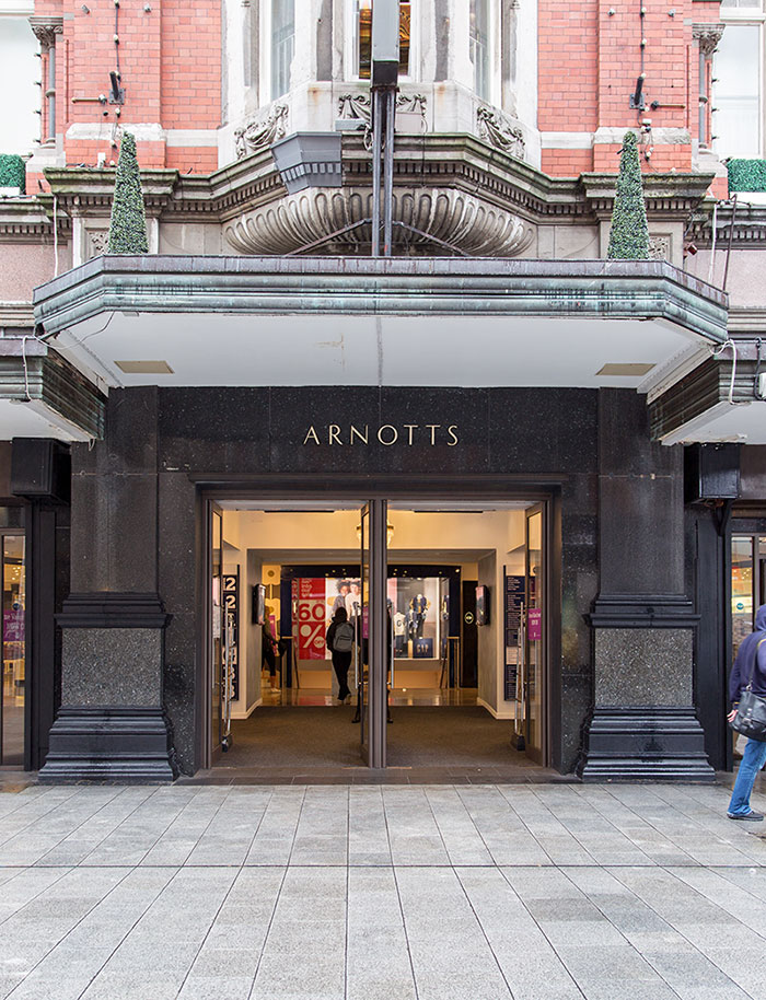
From the store. Literally it came from the physical store. We were looking around for a piece of visual heritage or inspiration to help us. We couldn’t build from the brandmark because at the time that was being redesigned by another team, so we went to the store and just walked around, looking.
What did you see?
Well for the first while nothing popped out. It’s a really interesting building. On the Henry Street side its architecture is Victorian, on the Abbey Street side it was originally Art Deco, but it’s been heavily reworked.
It’s like these two different eras had been smashed together and then hollowed out. But still dotted around the store, from both sides, there was one shape that kept on repeating. This kind of chamfered, or chiseled shape.
So we decided to take it for a walk. I got back to the office with a few sketches and just started to play with it, as a ribbon, a box, a border, as glass, as 3D etc etc. As a creative solution it quickly proved its potential.
In the end I think it worked for two reasons. Firstly, because it was literally ‘of the store’ it reflects, and connects to the physical experience of Arnotts. The website feels like the brand, not an extension of it, or the digital side of it, but just the brand.
And secondly?
It was so simple.
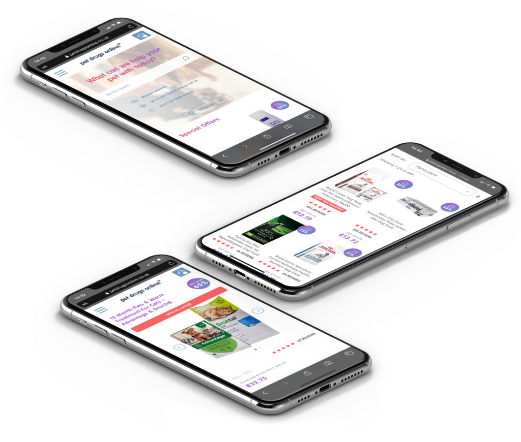
Econsultancy recently shared a post called ‘Four online experiences that impressed me during lockdown (and what brands can learn from them)’ and our client Pet Drugs Online were listed as one of the four.
We’ve worked with this brand for a number of years to reimagine their digital brand experience which led to the design of their eCommerce platform built on Magento.
Considerable thought was given on improving the whole user experience and it was a delight to see the author to pick up on the details we worked hard on and that have delivered such strong results for the brand that made them the No 1 Pet Care brand in the UK.
If you want to know a little more behind the project you can read a more detailed interview on the story behind it all. Alternatively you can view the case study where there’s plenty of lovely pictures of pets.
Born on the 24th August 1899 in Argentina, Jorge Luis Borges was an iconic and unique thinker who created magical stories in his writing. Borges had a strong connection with Ireland formed through his passion and interest in famous Irish writers like Oscar Wilde & James Joyce.
Many stories have been written about his links to our nation, including an article by Newstalk who noted as a result of this affection for the country and its authors, his works are littered with Irish references. In his short story ‘The Shape of the Sword’, the protagonist is from Dungarvan, while in ‘An Examination of the Works of Herbert Quain’, the story opens with a line that states that Quain recently died in Roscommon. Similarly, the story ‘The Theme of the Traitor and the Hero’ also takes place in Ireland, set in 1824.
We took inspiration for our name from his short tale ‘UNDR‘ in the Book of Sand. UNDR we took to mean wonderment which we shortened to WONDR.
We took inspiration for our name from his short tale 'UNDR' in the Book of Sand. UNDR we took to mean wonderment which we shortened to WONDR.
When we had our first premises we converted a shop into our creative hub and had a display window facing the main street which contained pictures of the man. Often we would get travellers, particularly Argentinian & South Americans, who would stop by to ask about the story how a picture of Jorge came to find its way there. We were more than happy to tell them.
When you visit our Practice on Wicklow St you are going to see constant reference to the UNDR story and ‘The Mirror and the Mask’ also from the book of Sand. Each room in our building takes its names from the stories. For example, our main creative studio is called Olan. Skald is our second studio. Uppsalla is where we meet to converse and eat. You get the picture.
Our main boardroom is named, Borges, after the man himself where you’ll find the portrait from our old shop window but also a portrait of him as a young man.
This picture of Jorge at the age of 21, captures a young man who had the clarity to define a vision and forge a brave path that led him to inspire many generations of writers and creatives like ourselves.
We thank Jorge Luis Borges for showing us the way.
To celebrate his writings our Brand & Strategy Director, Oisin, created a series of short videos to capture the mood, landscapes & visions painted in Jorge’s words. One day we plan to make this into a much richer experience to bring these stories to life in a new digital journey.
The Journey
The Journey
The Sea
The Sea
The Sea Curve
The Sea Curve
The Fire
The Fire
The Mountains
The Mountains
UNDR
UNDR
Philip Dwyer Chief Digital officerIt truly changed the perception of the Highway1 programme in San Francisco, and it definitely placed the programme ahead of its competitors in terms of communications.
PCH
It’s the sort of statement made by many an agency about their projects — but it’s rarely can delivered with such sincerity.
For WONDR Brand Director, Oisín Hurst, however, it’s 100% justified. For not only had he and WONDR founder, Dermot O’Shea worked to develop a digital presence that showcased future startup — but the project also gave the PCH a story and experience that would lead to greater recognition.
Of course, while these changes would end up impacting just about every facet of the wide-ranging business, they all stemmed from a response to one relatively small problem.
The hardware company, which was founded by Irishman Liam Casey, made its name working with Fortune 500s companies (well known phone, tech & fashion brands) and IoT startups ranging from flic to Ringly to develop, manufacture, package and distribute hardware products for companies that ranged from plucky startups to large multinational corporations.
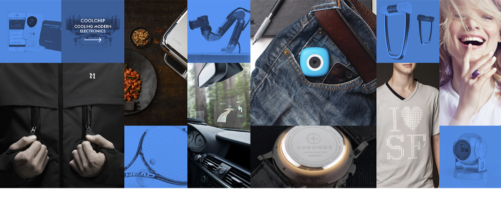
The issue wasn’t that Fortune 500 companies weren’t on board — in fact, it scored highly in brand awareness with them. The problem was many people weren’t aware of its supply chain capabilities; in other words, it was limited in perception to a mere manufacturer.
As part of its services, PCH was bringing products from the drawing board into people’s hands, taking startups through every step of the process — an end-to-end process that was being missed by clients. That knowledge gap prompted PCH to review the entirety of its business — including its seven business units which cover areas B2B, B2C, B2B2C and more — and from there, it created a product that would be consistent but also caters for the differences each unit offered.
When WONDR was approached by Philip Dwyer, PCH International’s group Chief Digital Officer, the aim was clear: to avoid the clichés associated with corporate sites and blogs, mainly one that only pushed its own announcements without offering anything in return.
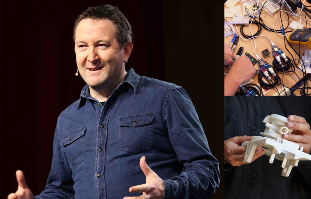
“PCH had a great story, particularly Liam Casey’s journey to build the company into a trusted partner with some of the World’s best known technology brands,” says Dermot. “As an avid fan of WIRED, I was well versed with getting information around hardware launches as a consumer, so this project gave me a chance to understand it all from the business side too.”
The approach taken was certainly different, Oisin notes, “As Philip proposed the first PCH project to us, it was clear that he intended to use digital as the first platform to express the brand repositioning. He was very open about the fact he didn’t want yet another corporate site that would act as a recording archive of past press releases.”
Instead the brief was to develop a strong digital platform that would clarify PCH intent in the connected hardware revolution. Working on the master site and all the sister sites, we managed to produce a convincing industrial and service story.
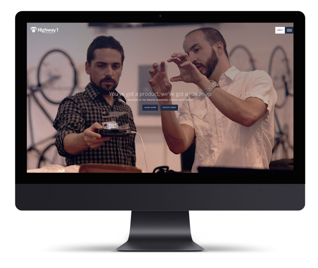
The standout example is its hardware startup accelerator Highway1. On the landing page, you’re presented with a short background video showing what it offers, a clean design, large images that catch the eye, two main colours — sky blue and white — to complement each other, and a straightforward interface that works both on desktop and mobile.
This is a great representation of WONDR’s work — communicating the main thread connecting all of PCH’s units: the speed of hardware innovation, the momentum driving connected hardware and the worldwide ecosystem behind it. All while maintaining PCH’s unique identity.
Dermot says, “Highway1.io tells that story best. We transformed the website from a simple start-up registration form to a strong showcase of the alumni startups; the blog quickly became a must-read destination for all hardware start-up looking for an accelerator programme”.
Telling that story helps prepare those visiting Highway1 or any of PCH’s services. By getting a sense of what it has to offer, they would know they were engaging with something more than just a hardware service.
About
Highway1
“PCH were very active at the time on the global tech event circuit, regularly featured in WIRED, TechCrunch and The Wall Street Journal, so they needed their digital branding to reflect the scale of business they truly were,” says Dermot. “Also they were well connected with the VC community in Silicon Valley so it was important that when those influential people visited any of the web platforms ahead of a Demo Day for example, that they got the sense they were dealing with one of the world’s best.”
While it’s an obvious thing to say, having a clear digital presence is important — all the more so for PCH, allowing it to use the many different advantages brought about by digital, including gaining customer insights, improving relations and customer lifetime value.
In short, it’s easier to find leads, improve collaborations and grow demand through digital, making the redesign more than the sum of its parts — and this digital version of the company perfectly represented what the team was trying to get across in the first place: end-to-end integration.
“More importantly, it provided an opportunity for PCH Group companies to present the unique, seamless and interwoven customer journey, emphasising end-to-end services with demonstrable case studies in how we deliver continuous customer value creation,” says Philip.
“We don’t see digital purely as a channel to market, particularly as digital continues to create new frameworks for industries and consumers alike.”
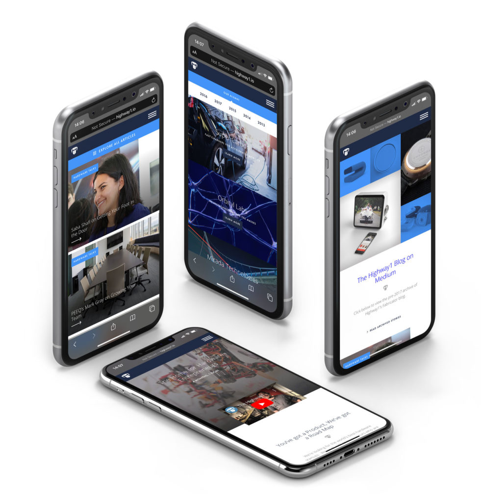
“Consequently, digital has provided strong scalable advantages internally by improving executive strategies leading to business process optimisation, and enhancing capital and resource efficiency across the business”.
Highway1 wasn’t the only standout project WONDR worked with PCH on. there was also the official rebranding and launch of PCH Group site at the Dublin Web Summit. It too followed a similar line of thinking to Highway1.
“WONDR utilised rich publication solutions to create an immersive experience that not only clearly articulated the PCH Group proposition, but additionally facilitated deep-dives into the unique services offerings from PCH,” says Philip. “It continuously delivered countless competitive advantages for Fortune 500’s and startup IOT companies along the journey from prototype to consumer”.
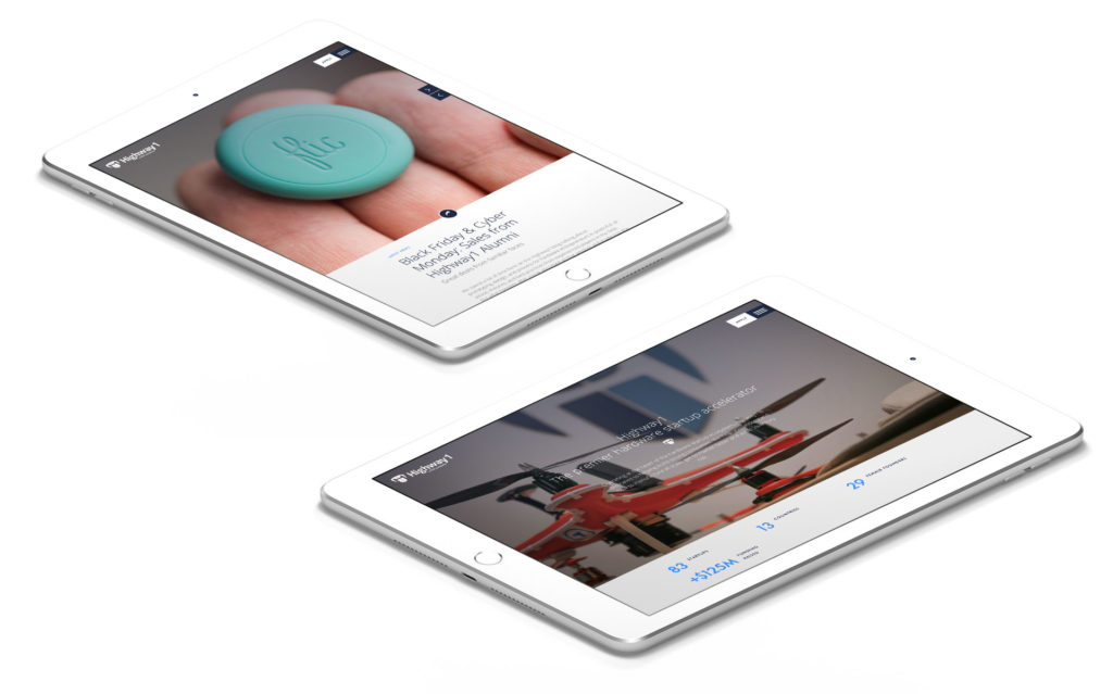
Not to mention the launch of Hardware for Health, a strategic collaboration between PCH and Johnson & Johnson Innovation, which looks at advancing new healthcare solutions.
For that, WONDR developed a responsive site with integrated CRM (Customer Relationship Management) functionality, catering for the custom-fit programme that brings innovative health hardware startups from concept to the consumer.
And that’s not including how it’s assisted PCH in other group companies like TNS Connect and PCH Access. It’s a partnership that has reaped dividends for both parties.
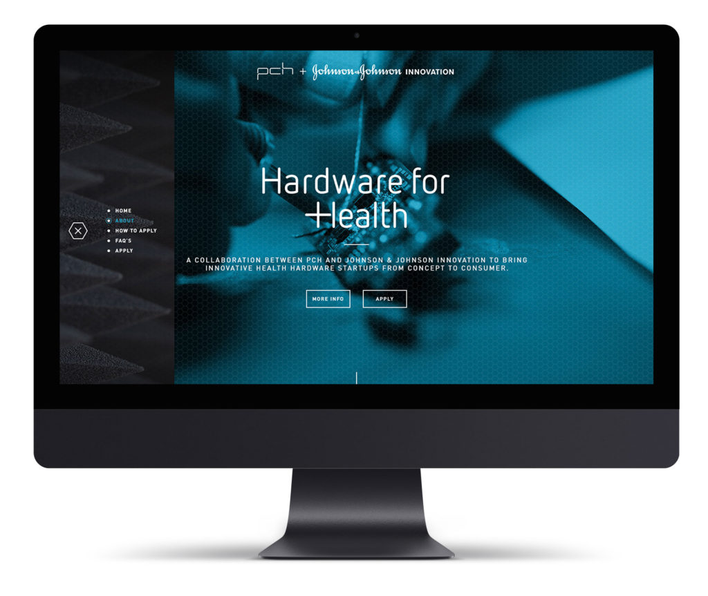
Oisín remarks, “Digital is a core space for the development of direct business communications. Controlling owned platforms makes it easier to develop leads, develop demand and increase collaborations.”
“For example, as PCH collaborated with Johnson & Johnson to develop a health hardware accelerator programme, we were able to develop a communication platform and a registration service in just few days. The first registrations came in within just a few weeks of the businesses agreeing to the programme.”
While Highway1 is seen as a jewel in the crown, with everyone saying it’s the project they’re most proud of, really the main draw is how the entire project came together as a collective.
“I’ve said it a few times to anyone that will listen, that Highway1 was one of my favourite projects as it gave WONDR a chance to show the difference digital branding can make,” says Dermot. “Two years later, the brand and its digital presence hold up well and document the early stages of startups as they invent the products of the future.”
“Collectively, it was developing the holistic group brand proposition for PCH, while also implementing a portfolio of digital assets that both showcase and seamlessly integrate PCH’s end-to-end digital solutions platform,” says Philip.
“Yet at an individual project level, it is Highway1 that stands out. It was a pleasure to collaborate with the team at WONDR in developing a site that captures its unique and compelling offering.
They welcome you home. They purr, they bark, they chirp. Some of them get you up for a brisk walk on a crisp Winter morning when all you want to do is stay under the duvet. They’re dependent on you when they’re sick and hungry.
All across the globe, pets are cherished companions and owners do what they can to Love Them Well. This is the insight that helped us make the online pet medicine retailer, Pet Drugs Online the best performing Magento eCommerce site in the world.
Although the business was performing well as an eCommerce platform, the real challenge was to stand out in the market and build trust with new consumers. We partnered with the client team to define their digital brand & user experience design in order to build trust, make the purchase of pet medicine easier with overall goal of increasing the online revenue.
For WONDR, delivering results for eCommerce clients is all that matters.
Just a year and a half later Pet Drugs Online have seen significant revenue uplift from investment in the UK, ahead of a European roll out plan.
YoY growth in 2019
Estimated YOY growth 2020
UK Pet Healthcare brand
Neil Fitzpatrick Pet Drugs OnlineWe went from 3rd biggest Pet Health Care brand in the UK to number 1 in 18 months. The work we did with WONDR rolled out across every channel. The brand message is clear. We are the brand that allows you to love your pet better.
Managing Director
Defining business goals
For WONDR it started with in depth discovery sessions to understand the business, its systems & people, listening to all staff members and compiling a coherent plan to set the project in motion.
Just simply having functional digital transactions is not enough anymore, building brand trust and an emotional experience is critical as it has always been for brands, just the technology has changed.
Working with a progressive minded culture that Neil has built in PetDrugsOnline gave us the opportunity to demonstrate that setting your digital brand right is just as important as getting your UX journeys nailed. We know how to help brands deliver great customer experiences that make significant uplift to brands online revenue.
Setting the brand
As part of the process we helped define the brand positioning of ‘Love Them Well’ and created the brand system for all digital channels. This included brand mark refinement, typography, UI styling, photography guidance, patterns, eCommerce component styling, as well as a complete set of social and video templates. This set in place a simple set of guidelines for the in house creative team to implement.
Dermot O’Shea WONDRBuilding brand trust and an emotional experience is critical as it has always been for brands, just the technology has changed.
Digital Architect
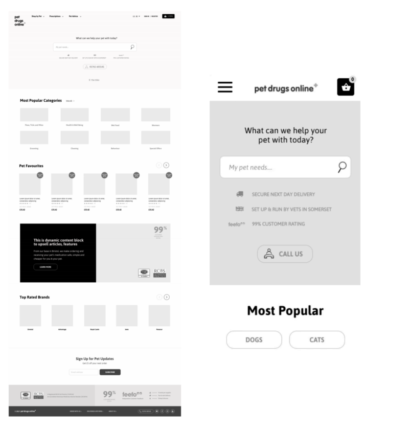
Building a richer user experience
We researched this brand and user experience extensively to get a solid understanding of what the opportunities were there to deliver better customer experiences and increase revenue.
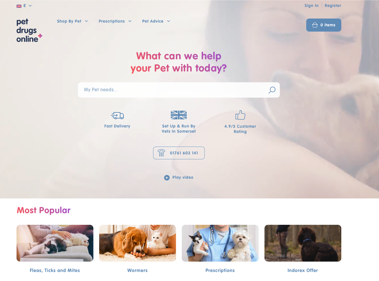
Dermot explains, “The brand had a reasonably good conversion rate, however it was clear from research that the PDP and checkout pages needed particular attention. We had to make the process of uploading prescriptions easier and remind people that this is all for the love of their pet, so finish the journey.
We carried out extensive user research which included GA analysis, user video analysis, stakeholder interviews as well as one to one sessions with customers to establish what works best for the them.
We prototyped fast, tested with the call centre staff & real customers as we went to refine and adapt the user experience. This was invaluable as it allowed us to make modifications to help us refine the checkout in particular. The financial success today as a result of this, speak for themselves.
Oisin Hurst WONDRDon’t be frightened. Don’t skimp on the user research as part of your budget. Listen to your customers, it will pay to do so!
Digital Architect
Putting design into motion
Oisin Hurst, WONDR Creative Director says, ‘After we set the brand we created a cloud based tool kit which allowed all of the integration team and 3rd party tools to access one central library to get all the brand assets and styles. This made iterating new features and rollout of front end much faster than traditional methods.’
Setting emotion on the website was important and we did this through video, imagery, typography, copywriting and colour palette to communicate the brand proposition.
The prescriptions journey was designed to be effortless, leading with in site search to help customers find what they needed faster. To create a richer, topical and genuinely useful experience we created an advice centre for users to discover pet-care tips and related, relevant products.
Video content is critical for mobile and we build a system to allow the brand to launch the platform and refine core propositions, guided by three pillars, Trust, Convenience and Value.
Neil Fitzpatrick Pet Drugs OnlineIn an already crowded market, we are the only brand in the UK growing at that rate and that shows just how on the money the overall brand revision was.
Managing Director
A partnership for success
Partnering with clients for product management can’t be underestimated. We helped the team to brief, document and liaise with the chosen integration partner.
Understanding the development process, we assisted the Product Owner in Pet Drugs Online, pushing as much functionality into the first release as possible and worked closely with the team using Confluence to set the project and manage its delivery.
Creating a lasting bond
The brand invests heavily in PPC and SEO but to complete the journey we needed to build audience engagement and real connection. In a move away from generic posting we devised a campaign that would build trust and emotional connection. Brought to life through some simple social video advertising that struck a cord with pet owners.
Here at WONDR, we’re excited to reveal that we had the exciting job of setting the brand narrative for the CSS Design Award’s Website of the Year 2018 showcase website.
We’re so proud to be flying the flag for Irish design 
We caught up with two of the WONDR team responsible for bringing this landscape to life. Meet Creative Director, Oisín Hurst and Creative Front End Developer, Clément Grellier. They chatted about the highs, the lows and all the jellyfish in between.
What was it like to be involved in creating Website of the Year Awards site?
Oisín Hurst: Exciting and intimidating.
Clément Grellier: Yes, it was great to work on something focussed on collaboration with freedom of creativity. Of course there’s a big responsibility and expectations at are an all time high — it’s being seen by the entire design community! But that’s an incentive to make sure the work was unique and interesting.
What makes the CSS Design Awards so special?
OH: For me, their mantra of ‘Inspire and be inspired’. The highest thing you can do as a creative is inspire others. If you have work commended on CSS Design Awards you have a platform to potentially inspire someone else. That cycle of creativity can start again. It’s a great social goal.
Why, in your opinion, are the CSS Design Awards important to creatives in the industry?
OH: To me it’s the peer review that adds value. With the CSS Design Awards you genuinely rate the judges — it gives huge weight to the awards. It’s not someone from outside of your field judging design.
I also have a huge admiration for the effort that goes into judging and maintaining the site, and the depth of the view, you can really lose yourself in it. There’s lots of great work to discover.
CG: Yes, for me the wider community aspect as well as the peer review of the rewards.
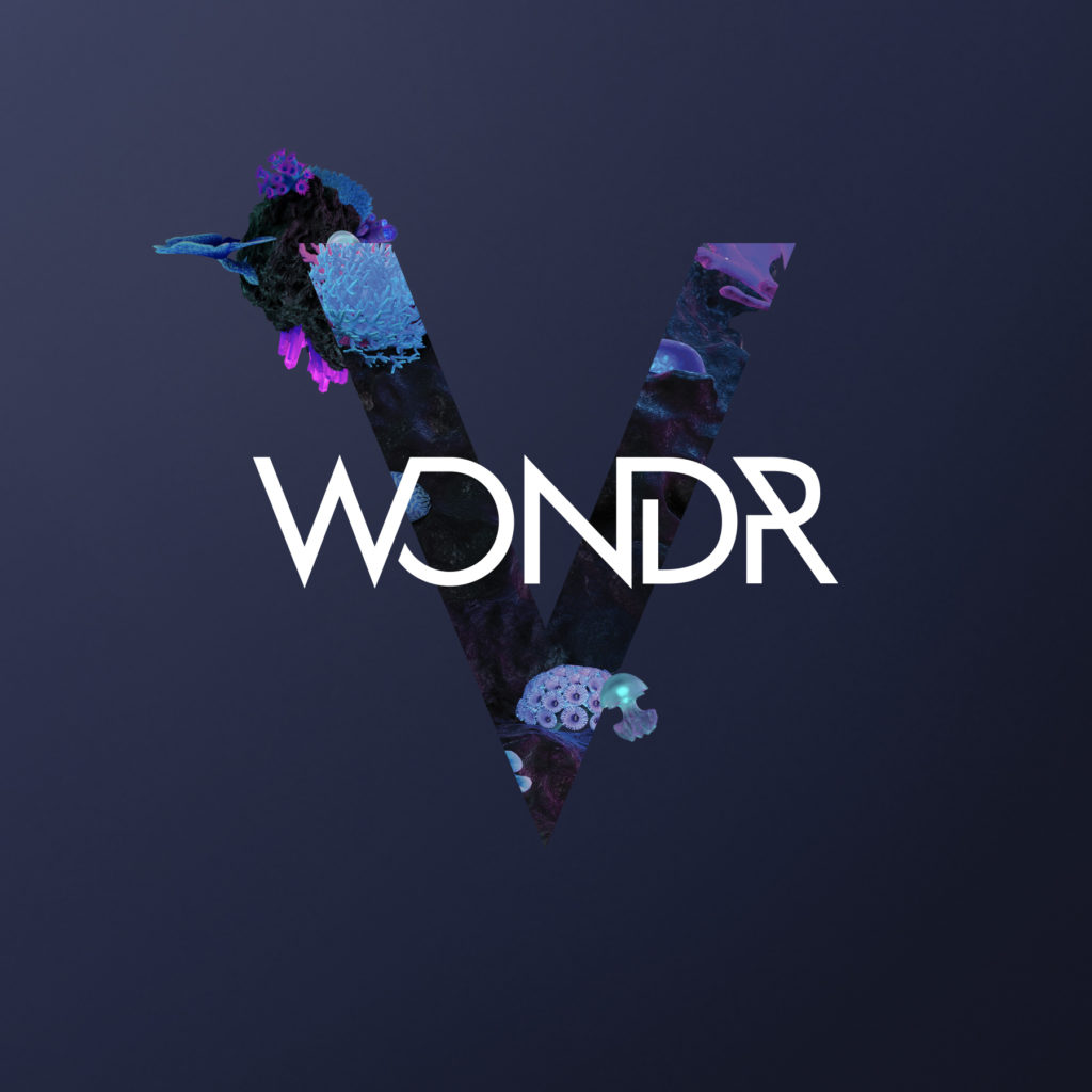
What inspired the brand narrative “Coral”, our world under the sea?
OH: We wanted to create a narrative that tied in with the proposition and positioning of the CSS Design Awards brand and translate that into a visual concept and a wider digital experience.
Oisín Hurst WONDRTwo aspects stood out to us; firstly the sense of community at the heart of CSS Design Awards, and two, the cyclical journey of inspiration.
Creative Director
It was a metaphor that encompassed thriving creativity and crucially, the idea of community. The notion that we are floating through a vast sea of noise and debris on the internet but when you discover CSS Design Awards you land on a vibrant creative community. It’s our own creative island to be inhabited, much like a thriving coral beneath the sea.
Can you tell us how “Coral” was brought to life?
OH: The coral is a neon island of creativity, floating in a vast digital environment. We created the 3D hero coral by dressing it with neon plant life and lighting it with hues of pink and cyan. We also created a range of secondary corals that included the trophy, crystals and our jellyfish (named Squee).
There’s also a little surprise when you reach the footer. When a visitor scrolls down to the base of each page, they break the water’s surface and discover that the entire experience is actually upside-down.
You explored a few themes before you got to “Under The Sea”, what ideas were killed during the process?
OH: We explored a few different avenues.We wanted a world that had enough variety to create a convincing environment. Our initial idea was a typographic route that encompassed a complete alphabet with seven versions of each letter. But in the end, we decided the typographic route was a little too cold and clinical. It felt natural to come back to the coral which was a richer interpretation of community. That notion was core of the brief.
Oisin, typography still features heavily, how did that evolve?
OH: We took some of the typographic learnings from our initial creative research into the final typography for the site. We agonised over getting movement lifelike and in the end we decided it didn’t have to be literal, as long as the underwater feeling was achieved.
That movement is integral to the theme, can you talk us through that, Clément?
CG: I tried to recreate some of the ideas Oisín had around typography by taking 2D assets and making them look 3D to give them depth. We were keen that the letters would move with the mouse to mimic the underwater feeling of floating, in order to match the coral world.
Clément WONDRHarmonising the movements with the under the sea concept so it was believable was important to the concept. It also kept it natural looking, interesting and interactive.
Front End Developer
The 3D coral is a hero element, can you tell us about the making of it?
CG: An element of play was really important which is why the 3D effect is key. Again we wanted to mimic the underwater feel and make it look more dynamic and interesting for the user.
OH: Yes it was key to bring that habitat to live with 3D. At first we made rotating 3D animations for every asset. We had a master coral with about 5 different coral “children” not forgetting, Squee, our jellyfish. We even created a coral version of the Website of the Year trophy, the CSS Design Awards logo and our own WONDR brandmark that blended nature and technology together.
How was the collaborative process between design and front end development for this project?
OH: It was really open. We didn’t do detailed page designs. It was always more of a conversation on how things could work rather than a prescriptive process. Clément instinctively knew how to elevate the designs I brought to him, creating an immersive experience that surprises the user — giving it the ‘wow factor’ I suppose.
CG: Yes, it was always a work in progress — we just kept bouncing ideas off each other. I think this is the best way to work. It’s how we were able to make the experience a bit more interesting. Open communication meant we stayed on schedule, which is important!
It’s sounds like that dialogue was key to this project?
OH: For me, when I finish something there’s always the temptation to go back and over-work it. It was really important to have the input from the team to know when to stop!
Any challenges you had to overcome once you got into the project?
CG: One of the main challenges was performance because of the amount of data. The weight of data for this project is quite high as we have to parse all the votes, nominees, judges, winners and display them in a dynamic way. It was quite challenging to handle all that data and re-organize it, sort it and filter it.
The other challenge was the assets. As we wanted to make the assets interactive and have them move and rotate, we needed to have a sequence of images for each asset ,like the letters and the coral, which increases the weight of the page. We tested and went back and forth before finding the right way to do that and made sure everything is loaded correctly.
We used very specific properties like masking videos, which made the QA more difficult because some of these properties are not available on all browsers. We often had to code a specific alternative to make sure it displays properly on all modern browsers (although the experience is best viewed on Chrome).
OH: Yes, as you work through it, you think you’ve killed all your darlings at concept stage, but then you realise there’s plenty more to kill. We had particle effects and additional movement that sadly, had to be cut. There comes a time you sacrifice things to the ‘gods of performance’. You have to decide what’s bone and what’s flesh. Protect and what you can, sacrifice what you can’t.
Favourite thing about the Website of the Year website, now it’s complete?
CG: The underwater universe. The creativity of the concept and bringing it to life.
OH: The magical realism of the site. The fact it floats and it feels electronic and magical at the same time.
You’re now well into your fifth year, how did you get started?
Yes time does fly. In 2014 it was a busy year for me both professionally and personally. I had just got married, had a kid, bought a house and I thought to myself you know what I need to do next is set up a company, sure what else would I be doing.
I had built a good reputation and bank of work but I knew the model for the work I wanted to do was changing and I had a clear view on what it would evolve too. I had plenty of good offers abroad and in this market to build what would become WONDR within the comfort of a larger agency environment. I felt it was best to stay at home in Ireland, re-programme my skills, stay independently owned and build something from the ground up that I would be proud of.
I had contacts made from years working in branding, one of them being Oisin Hurst (now our Creative Director). We worked on the GAA rebrand together and he was keen to introduce myself to a company called PCH who’s branding he was working on. They needed a strong digital partner to help them transform their digital presence to bring their new positioning to life.
This was a very interesting project and it gave me the confidence to get the business started. This became WONDR’s first client and was a major part of the initial story that helped the company to get started. I’m still very thankful to Philip Dwyer & the PCH leadership team for putting trust in myself to work with them as they were working with Fantasy Interactive at the time and it was a good endorsement to land this project.
Do you think the digital industry has changed since you’ve started?
Yes it has evolved massively, just look at any project you’ve done that is over 2 years old and you can see how fast things can date if they’re not constantly polished and optimised. We’re still in the early days of digital, so if people think digital is fast and complicated now, wait till they see what’s coming next.
I could go on about the role of data and user research, but most people by now know this is the future already but yet struggle to apply it to their day to day. If people just started with this they’d see huge improvement in their digital brand experiences.
One other area I’ve noted is how the relationships we have with client partners is evolving. We’ve helped client teams to structure and build their teams internally so where possible they don’t need us which is kind of against the typical ‘agency’ model.
We’re always keen to keep tasks in house on the client side where possible by building design systems that work across all applications and encourage clients to keep their budget to work with ourselves on hero roadmap projects instead.
Business growth comes out of brave choices.
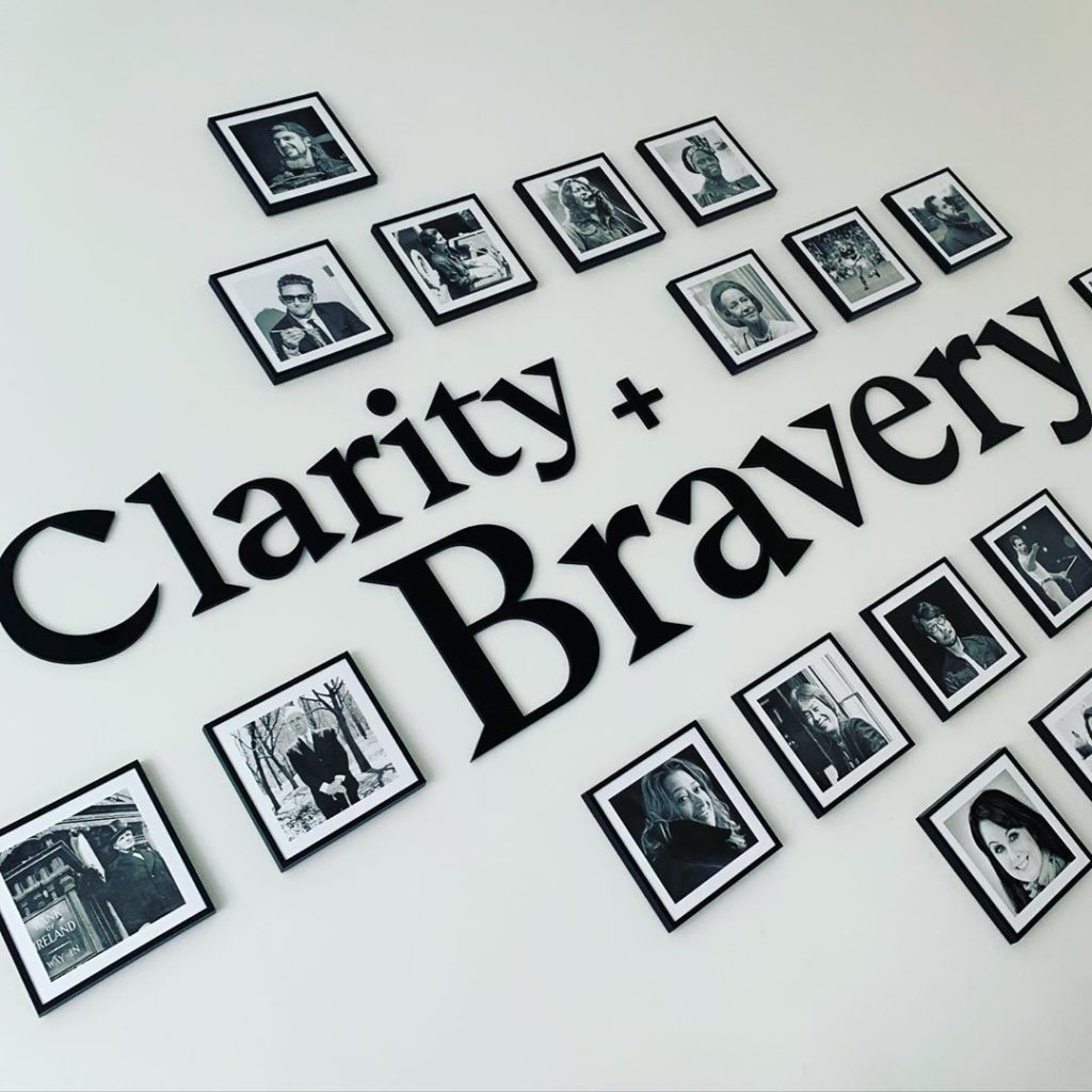
Dermot O'Shea FounderYour new positioning talks about clarity + bravery, why?
We like to carry out detailed discovery and definition stages that help to remove the perceived complexity from digital projects. I often tell new clients, we do the thinking up front to de-risk their project and investments as quite often digital change projects can evolve significant capital to make them happen. We’re there to make it a success.
When we looked at our positioning, we interviewed all of our key clients to help us shape and inform our approach. A common theme that kept coming back was the idea of a digital journey which they trusted us to guide them through.
Some were keen to highlight we removed the complexity to help bring them goals, experiences and results that mattered. We also took onboard the feedback that we’re very honest, open and not afraid to give people the advice they need. Anyone who’s worked with us will surely back us up on this point
We refer to this as being brave to make the right choices for the brand, not what’s right for our revenue or portfolio of work. Quite often digital projects involve cultural and organisational change where you have to make the brave choices up front on things such as brand, resourcing, technology & media to be successful. Business growth comes out of brave choices.
You describe yourselves as a Digital Product Practice. Why?
Ireland and in particular Dublin is changing all the time due to the sheer scale of international tech companies that come here, so we felt that the idea of an agency or studio belongs to the legacy of Advertising.
Their model works for them but not for us. We didn’t want clients to assume we worked to the same methodology or process as we have invested significant time in developing our ways of working.
Alot of our client work is on digital products and we operate an agile kanban methodology so we needed a description that reflected more of what we did day for day for our clients.
Which of your projects to date do you think epitomise clarity + bravery?
We recently partnered with UK brand called Pet Drugs Online. If there was ever a project that needed clarity + bravery then this was it. For us there was huge potential for this brand to disrupt the market and become the ‘boots’ of pet healthcare. We spent a great deal of time bringing clarity to their brand, UX & technology choices.
We were brave with our approach to refresh the brand and re-platform at the same time, the end results has seen a 47% year on year increase in revenue and each month they are breaking new sales records they never saw before.
You’re a company of internationalists, with talent from all over the globe. Is hiring from internationally important?
Yes we have a wide selection of languages and countries represented in the practice. It really helps to keep us open to change and the outside world as our team bring their experience to Ireland from France, Japan, Brazil, Canada, US and a far.
We’re constantly going to international events and awards to help keep touch but also to validate we’re on the right path.
Dermot O'Shea FounderWe aim to be a catalyst that sparks the next generation of digital talent in Ireland
We want to further add to Ireland’s growing reputation as world leaders in design, as we firmly believe the best work can be done from Ireland. It’s why recently we collaborated with CSSDA Website of the Year awards where the world’s best work was selected.
To be involved in this greater story is an honour but also validates WONDR’s reputation amongst our peers as being as good as any other market.
Do you have a vision for WONDR for the next 5 years?
We love eCommerce work in particular so in 5 years time it would be an ambition to be known internationally for our work in this field as I believe we’re already good as any other places doing this. Too many brands are still prisoners and passengers on their technology platforms and it’s our ambition to help people unlock this.
Finally I keep coming back to this idea you have to have pride in what you’re doing or else what’s the point. When I look back in 5 years time, I want to feel proud of the work the team has done. It’s my job to foster the culture to enable this to happen.

The #10YearChallenge has taken the internet by storm, so we’re doing it our way.
Instead of dodgy hairdos and questionable outfit choices, we’re opening the vault to some past work. In 2009, WONDR founder Dermot O’Shea and Creative Director, Oisín Hurst, were key parts of the team that rebranded the GAA.
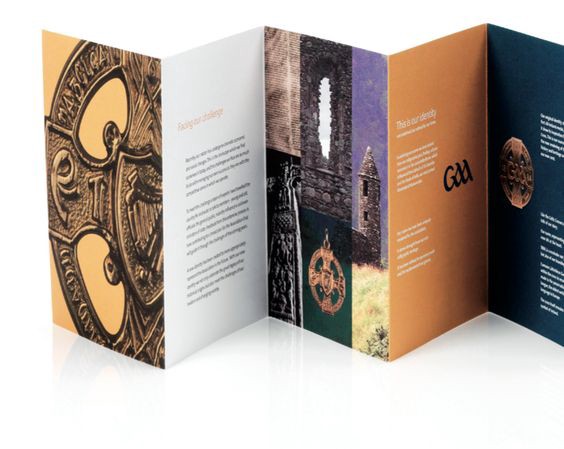
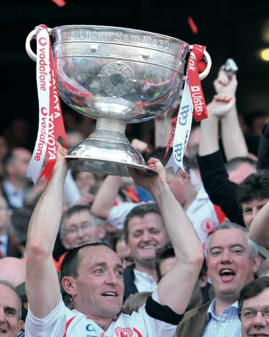
The GAA was founded in 1884 in an effort to preserve and cultivate our national games. Rebranding was also an exercise in preservation, to establish a brand identity that would meet the changing needs of modern Ireland. Ten years on, their work has remained culturally relevant, whilst retaining the deep heritage and storytelling of the GAA and has become an icon of branding.
The GAA is one of the last remaining true institutions in Ireland, what was it like working on such a behemoth?
Dermot: It was remarkable, everyone in the GAA and everyone on the project team felt the weight of expectation to deliver the right outcome. We were working with a brand with rich heritage, so the story was a special one. GAA has a deep history and is culturally engrained in our country. We all really, really cared as a project team and we all trusted one another to do the right thing.
Dermot O’Shea WONDRWe learned a lot about storytelling as a way to sell in the use of the branding. Talking to people in a real way and not highfalutin marketing speak. That still stands to us today when working with brands and clients.
Founder
What challenges did the GAA face and why did they need to rebrand?
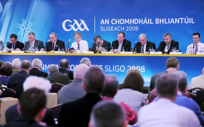
Oisín: With everyone from major commercial sponsors to local level GAA kids’ clubs using different versions of the branding there was ambiguity around the identity. Nowhere was the name ‘GAA’ prominent in any of the old branding and the institution was losing ownership of the Championships to corporate sponsors. They needed something that could be owned by the people — from HQ to grass roots clubs, so anyone involved in the GAA could say, “This is us”. We were really conscious of our responsibility to the GAA and to the local clubs to get this right.
No pressure then…..! How did it feel to be tasked to work on such an iconic brand?
Dermot: I didn’t see it as just a brand identity project. It was about the deep heritage of our nation and telling the story of our people. Something to tell your family about, that will be here long after we’re gone. If you do it wrong you will always be disappointed in yourself. We had a great trusting relationship with the client team which gave us the confidence to succeed.
Oisín: It’s a huge responsibility because if you do it right it will never have to be done again. If you do it badly though — well, that can do a lot of damage. You have commercial responsibility to make sure it works well at sponsorship level but also give back something that people can connect to and take ownership of. Ultimately, we understood the heritage and the place for the GAA and were able to make it work.
It was a huge research project, can you tell us about that?
Dermot: The project spanned three years and we reached out to the whole global GAA community, with over 8,000 people interviewed. From the Taoiseach to the grass cutter. Youth workshops were set up all over the country. Sports stars and GAA legends were also consulted. It was so big, our research made the Six One news. How often does that happen on a normal project?
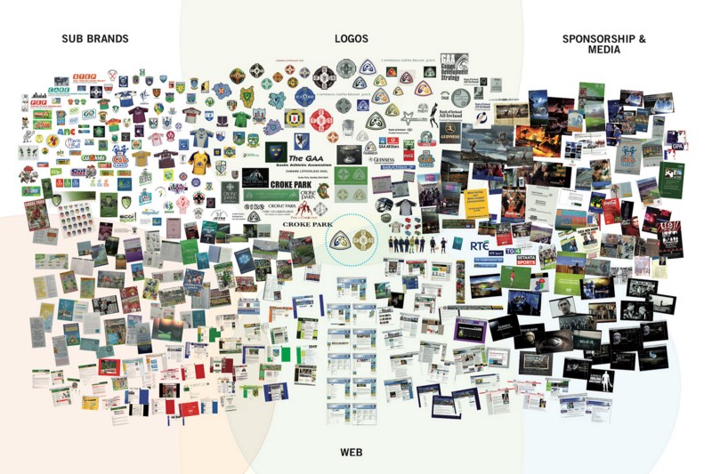
Oisín: Our audit of the brand evolved into an exhibition which ended up being housed in a dedicated hall in Croke Park. Our visual summary board had every artefact of GAA we could find. It was an array of brands connected to the GAA but not united. From championship to club level everyone had a different approach. We had to unify the brand.
Oisín Hurst WONDRIt’s a huge responsibility because if you do it right it will never have to be done again. If you do it badly though — well that can do a lot of damage.
Creative Director
Can you talk us through the logo and what each part represents?
Oisín: There are two parts, the brandmark and the heritage crest. The primary brandmark is the GAA name, uniquely crafted, drawing cultural resonance from Ireland’s calligraphic past.
Oisín Hurst WONDRThe name was uniquely styled, drawing strength from our ancient heritage while being refined to represent youth and games.
Creative Director
It’s been a busy year for WONDR. We launched some of our most successful projects. We made it our mission to empower clients to set their digital brand story and helped them realise great success to boot. We achieved some big goals in 2018.
We worked on some challenging and exciting projects. Won global awards, made big moves, got fresh meat by way of new team members (shout out to Tash the dog, our new favourite employee who freelances from time to time). So here’s how it all went down.
Winter
We kicked off the year with a Website of The Day award from CSS Design Awards for our work on New Music Dublin. Making us the most awarded Irish practice across CSS Design Awards, FWA and Awwwards.
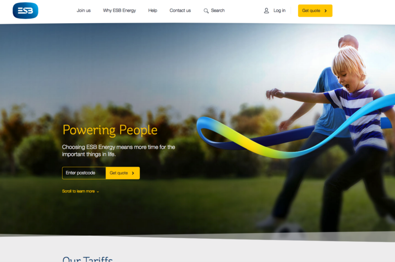
We made waves with ESB Energy UK working on a successful digital branding project and full site experience, creating motion design that even managed to work it’s way into the TV ad — proof that collaboration between digital and offline creates better experience for brands.
Spring
We welcomed Pierre to the WONDR team, all the way from France he brought enthusiasm, hipster bikes and the most french moustache we’ve ever seen.
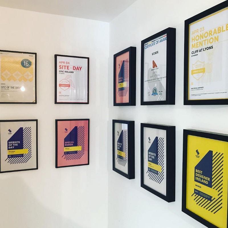
Then we got some amazing news — flying the flag for Ireland, we were named in the Top 10 studios in the World by CSS Design Awards. We’re absolutely convinced the best digital work can come out of Ireland, and this year we’ll be looking even more to set the international benchmark for great work.
Summer
In June we moved into our new office space on Wicklow St, right smack bang in the middle of the city. Four floors of creativity and a rooftop with city views (we’re yet to take full advantage of). We quickly became accustomed to bad buskers on Grafton Street, pints in Mary’s bar and the ‘Big Debate’ — which burger is better, WOW burger or Bunsen (the jury is still out).
Autumn
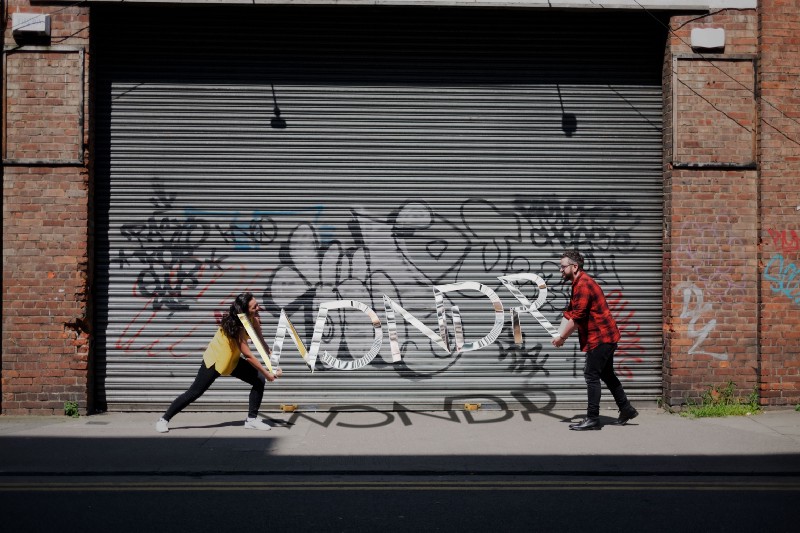
We welcomed our new Director of Operations Emily Miller — fresh off the plane from Canada, she decided poutine and snow is over-rated and there’s no place like home for the craic. She’s brought knowledge, expertise and invaluable insights from markets across the Atlantic.
We launched Pet Drugs Online’s new platform and turned UK’s most popular pet e-commerce platform into the world’s best performing Magento website by the end of 2018 — proof that partnering with clients and listening to what they need is the way forward.
That was just a little glimpse into the world of WONDR over the last 12 months.
Thank you to everyone who partnered with us, inspired us and liked us in 2018, roll on 2019 as we have some big projects and changes happening.
