Banking on Innovation & Experience
CLIENT
KBC Bank


INDUSTRY
Financial


AWARDS
- IDI Awards
  Shortlisted
- VEGA CANOPUS Award
  Best Banking Website
DELIVERABLES
- Competitive & Benchmark Research
- User Experience Research
- Google Analytics & Hotjar Recordings
- Stakeholder Workshops
- Personas & Empathy Mapping
- Segmentation
- Customer Experience & User Journeys
- User Experience Design
- Scenarios & Messaging
- User Interface Design
- Art Direction
- Design Support
- UAT

TECHNOLOGIES
- Liferay
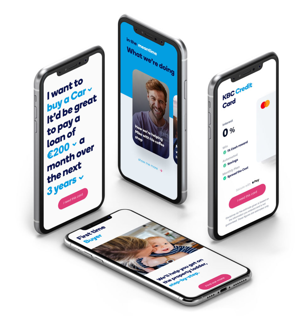

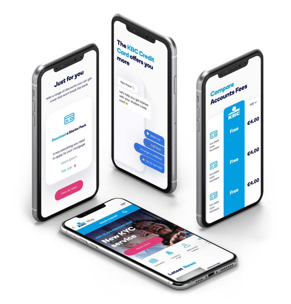
KBC Bank Ireland are on a mission to challenge banking norms by shaping innovation around customers’ lives. WONDR were tasked with reimagining KBC’s digital home and placing tangible benefits at the heart of every interaction, page and journey.

01. Research & Strategy
Business Needs.
Customer Clarity.
To ensure the new website represented and delivered for each business and technical unit within KBC Bank, WONDR hosted a series of workshops. This allowed us to collaborate in defining the vision, needs and functionality of the experience, encompassing customer journeys, challenges and barriers, compliance requirements and underlying technology and infrastructures.
Through these workshops all financial products, offerings and services were considered. Their existing customer journeys were reviewed, revealing strengths, weaknesses, gaps and opportunities for innovation. At the end of the workshop process the project had a detailed and actionable map of findings, recommendations and technical requirements. These workshops acted as a clear guide throughout the project. Competitive and benchmark research was also untaken to provide market context.
02. Empathy Mapping & Personas
Customers are our starting point and our destination.
Having embedded and educated ourselves through the workshop process we collaborated with the KBC team to develop an in depth picture of KBC customers.
Personas were developed to capture needs, goals and frustrations. These were divided into rational and emotion requirements for the UX/UI to address. This data was built into an empathy map which tracked customers experience from consideration, onboarding and every stage of engagement.
03. Innovation & UX Design
Rapid Exploration.
Rapid Realisation.
The level of information collected from the in depth research, workshop series and persona development enabled WONDR’s innovation and design team to work at pace, with absolute clarity.
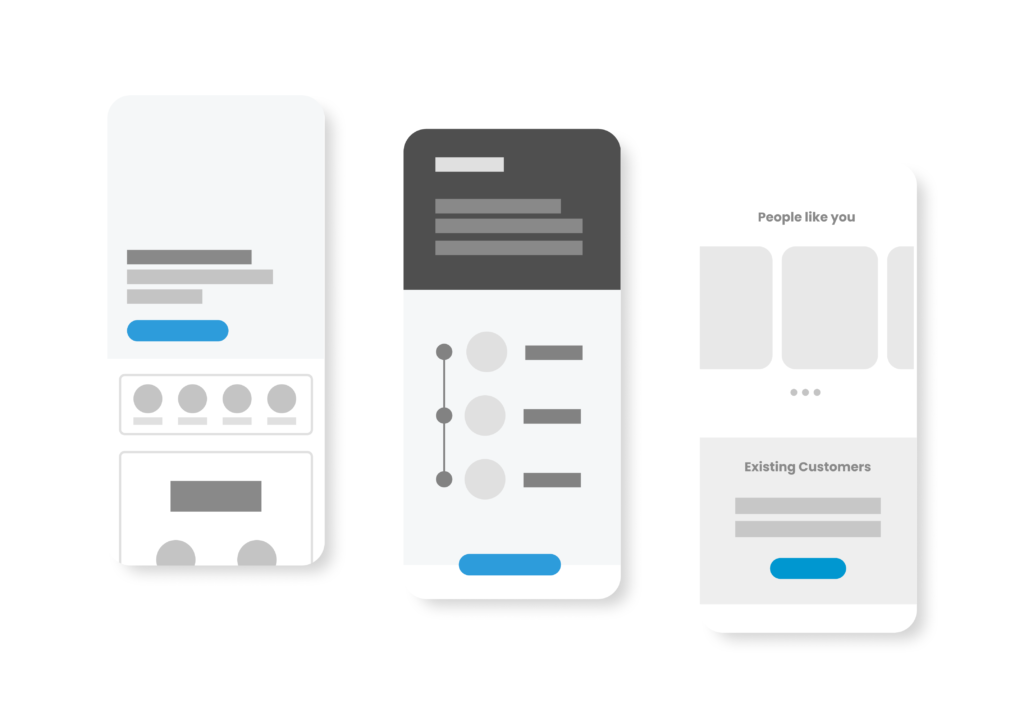
Light UX designs mapped customer flows, page structure and allowed us to clearly define what components and features we required to create a clear and intuitive experience for customers and the business.
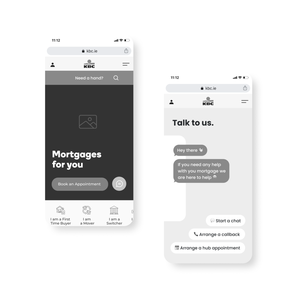
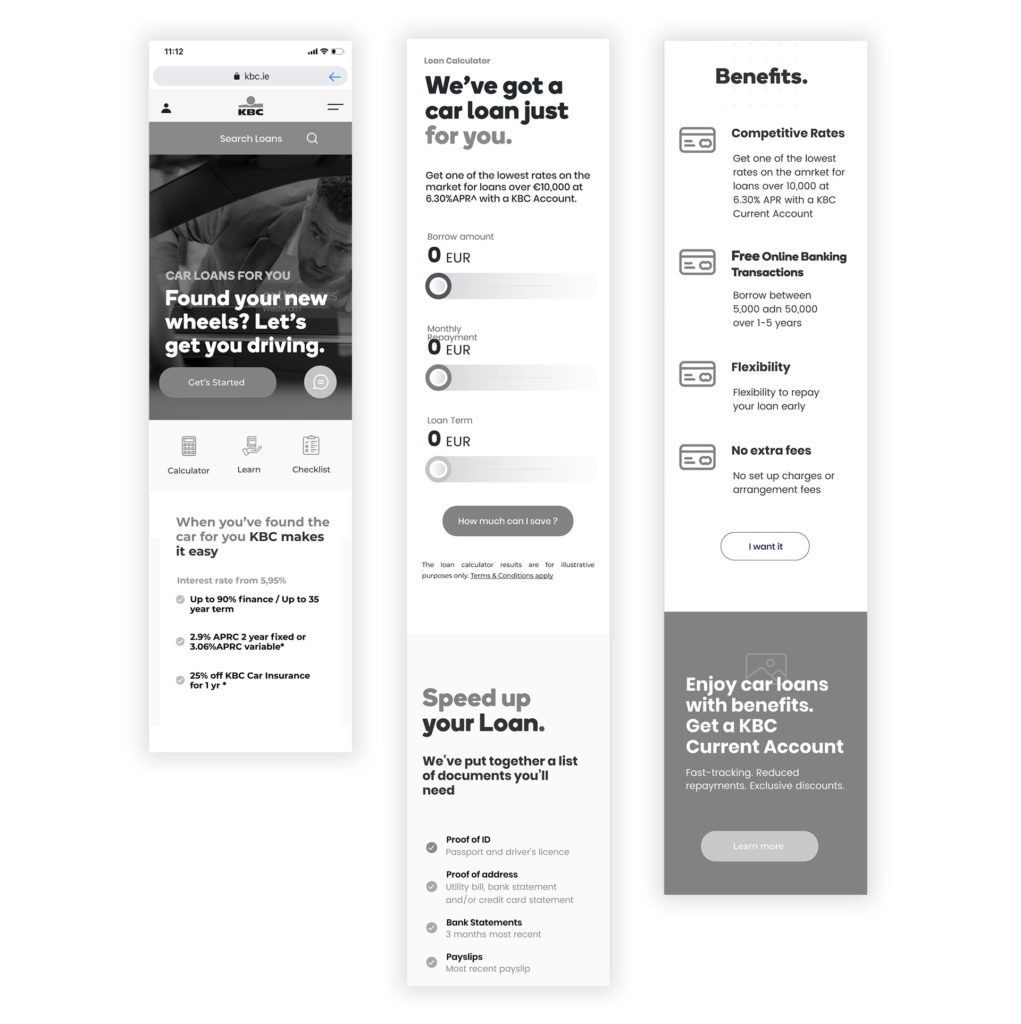
Then detailed UX pages were designed to add granularity to the designs. At this point tone-of-voice was considered to ensure the designs worked not only at a visual and function level, but also at a messaging level.
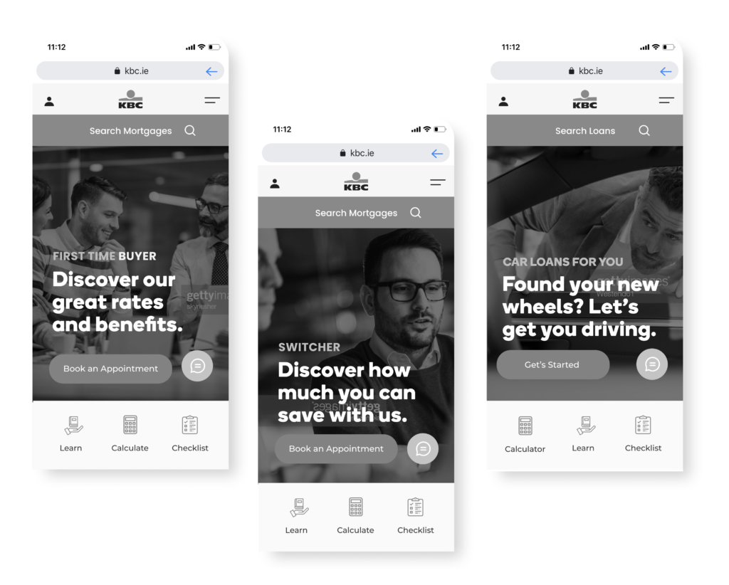
Understanding where and how visitors arrived on KBC.ie was a vital (and often ignored) part of the customer journey. WONDR worked closely with KBC to define multiple user scenarios, testing messaging and page structures based on inbound journeys from social media, digital display, EDMs and search engines. As a final step all designs were tested and HotJar recorded were used to interrogate and validate the design work.

04. Concept, User Interface & Motion Design
The Big Picture.
In Detail.
Rather than focus purely on wireframes and UX, WONDR then selected key pages and customer journeys to progress to the UI and prototype stage. This allowed the project team to not only see the rational picture provided by the UX designs, but also interact with a fuller, branded experience.
05. Design System
Brand Consistency.
Systemic Flexibility.
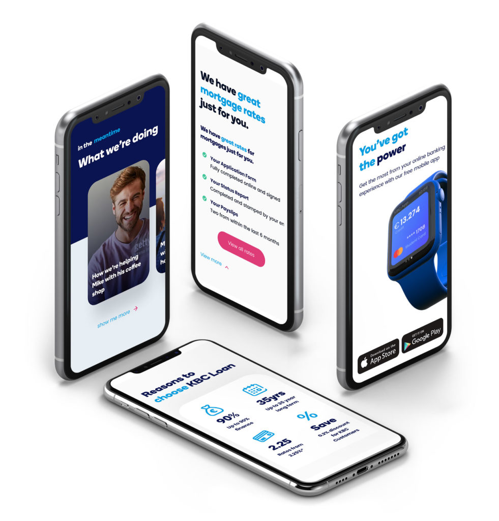
Having defined the UX and UI, a complete and detailed design system was developed to provide KBC with a structured and flexible library of elements, including all atoms, molecules, organisms, templates and pages. This system not only answered all current design needs, but enables the brand to meet the changing needs of the business with a consistent, on-brand experience.
06. Development, Guidance & UAT
From Prototype.
To Benchmark.
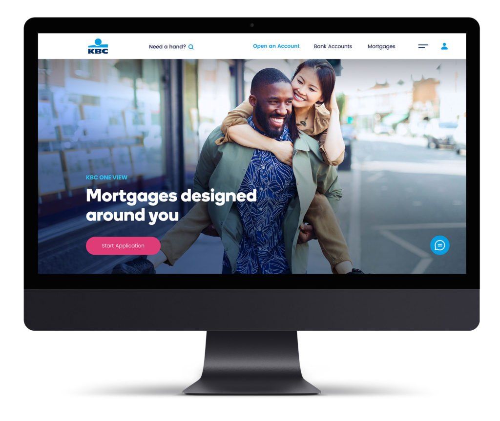
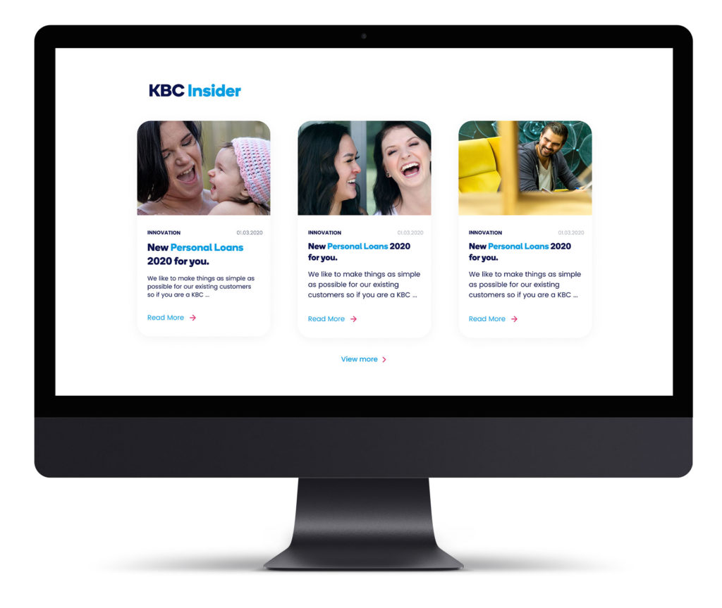
The design system also allowed the project to smoothly transition from the design stage to the development stage. As components, templates and pages were built, the team reviewed and refined the experience, providing QA testing, content advice and art direction. The result is a fully realised and innovative digital experience that places user needs, business requirements and technology in tandem step with each other.
Find Out More
If you would like to learn more about the KBC project or speak to us about a commission please contact:
_