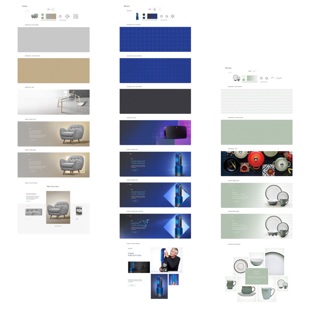
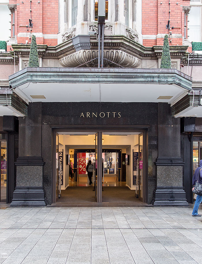
Arnotts are a well known Irish brand who have been around for a long time but with a little help from ourselves at WONDR, they have significantly increased their online revenue while transitioning to a new e-commerce system.
While many e-commerce projects focus on the system, we as a team also spent a significant amount of time focused on the role that the brand needed to play. Our Director of Creative Brand Strategy, Oisín Hurst, reflected on what it took to revamp the brand through the new ‘Salesforce E-Commerce Cloud’ platform.

Where did you start?
From a creative standpoint, working into a system like Salesforce E-Commerce Cloud is an interesting challenge. It’s a beast of system. It’s very established, robust and complex. It’s serious stuff. So one of the first things we did was to look for benchmark examples.
To see what brands and websites that had taken this technology, this platform, and created truly exceptional, branded experiences. That was our aspiration for ourselves and for Arnotts. So as a starting point yeah, benchmarking seemed to make sense.
‘Seemed to’ sounds like it didn’t pan out.
Well, it did and it didn’t. What we found was very few brands were achieving anything remarkable. Instead the platform was constricting them creatively. They were system shells. Pure merchandising and little else. The brands, even luxury ones, just poured in imagery, type and colour. It’s a little bit daunting to be honest.
When you see famous brands fall into this trap it certainly gives you pause for thought. Like, if it’s good enough for these big guys…
Why isn’t it good enough? Is it really an issue given Arnotts is a retail brand?
Absolutely. Firstly, a brand should never feel like a passenger on its own website. Premium retail experiences should have depth, not a veneer of brand presence. The UX, UI and underlying technologies need to lean into each other. From a UI perspective, the brand needs to be part of the website’s DNA, it should be a part of the building blocks, not just the paint at the end.
Also, unlike the examples we were finding, we couldn’t rely on seasonal campaign assets to do all the heavy lifting. Instead we needed to have a scaleable branding asset. Something that could work as a building block and extend into a full and rich design language. But it had to be very flexible.
It had to work during sales and promotions, integrate with imagery, act as a texture, be a box, be a pattern, be loud, be subtle, work online, work on social. It had to work for €4k earrings and a €10 potato peeler with equal credibility.
You’re talking about the ‘chisel’.
It’s an awful name for it, but yes.
Where did it come from?
From the store. Literally it came from the physical store. We were looking around for a piece of visual heritage or inspiration to help us. We couldn’t build from the brandmark because at the time that was being redesigned by another team, so we went to the store and just walked around, looking.

What did you see?
Well for the first while nothing popped out. It’s a really interesting building. On the Henry Street side its architecture is Victorian, on the Abbey Street side it was originally Art Deco, but it’s been heavily reworked.
It’s like these two different eras had been smashed together and then hollowed out. But still dotted around the store, from both sides, there was one shape that kept on repeating. This kind of chamfered, or chiseled shape.
So we decided to take it for a walk. I got back to the office with a few sketches and just started to play with it, as a ribbon, a box, a border, as glass, as 3D etc etc. As a creative solution it quickly proved its potential.
In the end I think it worked for two reasons. Firstly, because it was literally ‘of the store’ it reflects, and connects to the physical experience of Arnotts. The website feels like the brand, not an extension of it, or the digital side of it, but just the brand.
And secondly?
It was so simple.