Connecting Ireland's Power Network.
CLIENT
ESB Networks

INDUSTRY
Utility

TECHNOLOGIES
- CMS: SiteFinity 13.1
- ASP .NET Core ASP .NET Ajax
- Net Core 2.1 ScrollMajic
- Microsoft Azure Cloud PaaS RackSpace
- Visual Studio 2019
- SQL Server
- Management Studio Postman

AWARDS
- Sitefinity Website of the Year
  'Best Energy & Utilities' Site
- VEGA 'Centauri' Award
  'Best Energy Website'
LAB+ DELIVERABLES
- User Research
- Customer Journeys
- CX / UX / UI
- Concept
- AI User Testing
- Real-World User Testing
CRAFT DELIVERABLES
- Design System
- Content Design
- Copywriting
- Editorialisation
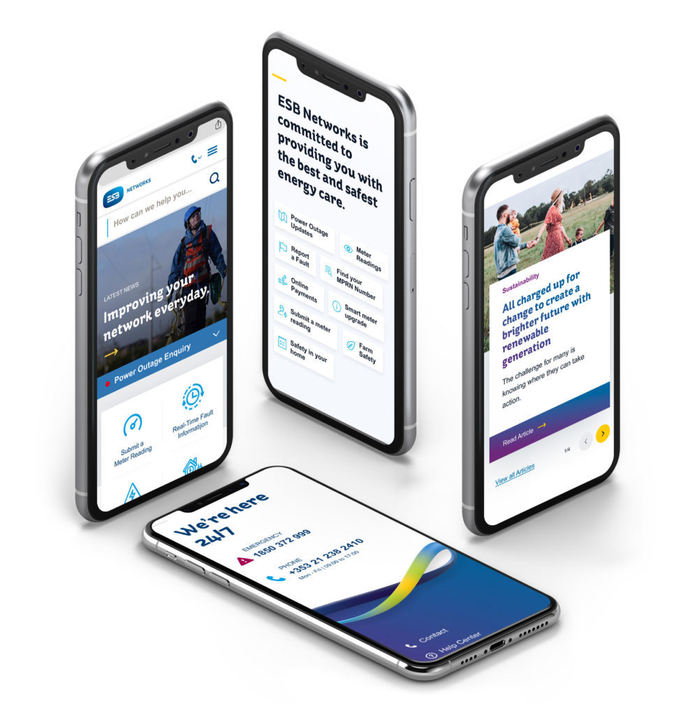
ESB Networks supplies electricity to 2.3 million homes and businesses across Ireland. As custodians of the nation’s clean energy future they ensure the national electricity network operates safely and efficiently. This is achieved through continuous investment in networks, services, new technologies and customer touchpoints.

01. Overview & Summary
100% Relevant.
100% Reliable.
The platform redesign gave WONDR the opportunity to modernise ESB Networks’ digital presence in order to fully express their customer-first ethos. WONDR were not only tasked with design, but were also commissioned to establish clear and consistent style guides, components and content which would be supported by intuitive layouts, editorialisation and easily understood hierarchy.
01. LAB+ Rapid Research & Design
Translating Research
Into Tangible Benefits.
The LAB+ stage begin with rapid research into user behaviours, customer pain-points, issues and critical journeys. This allowed us to identify the underlying needs and opportunities that we would later use to improve the digital experience for all users. As an example, one clear challenge was how best to adapt the website during the power outages. By answering this issue we helped users get to the information they needed quickly.
Through our LAB+ phase we were able to use design to provide a business benefit (in this instance, reducing the pressure on the call centre team) while also providing a customer benefit (the right information, delivered with immediacy). In all aspects of the redesign, ease-of-use and reliability was of the utmost importance.
02. LAB+ Defining the User Experience
User-Centered.
Clear Vision.
In order to ensure rapid and reliable access to information we improved site accessibility for a wide range of users. The platform provides vital information and customer journeys, from managing their online accounts to finding safety instructions and community updates.
Information Architecture
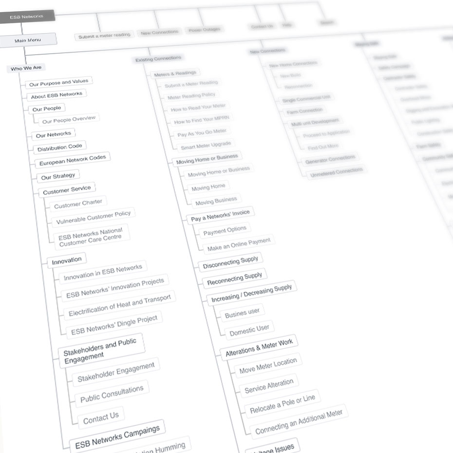
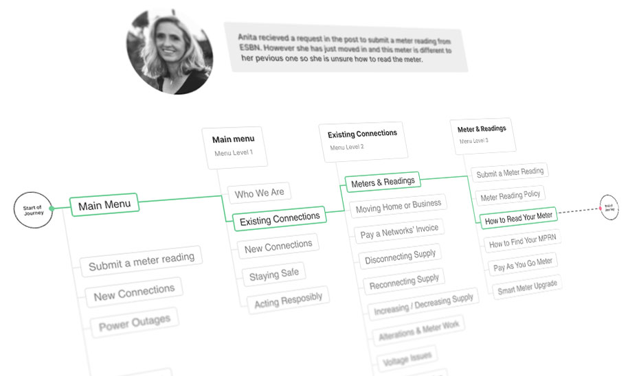
WONDR reviewed the information architecture, navigation and content strategy. We mapped out a range of user journeys to ensure user needs were always met. Using defined personas helped us identify the different needs of individual users across specific situations.
Personas
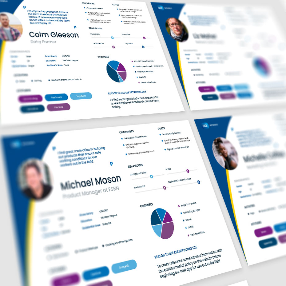
User Journeys
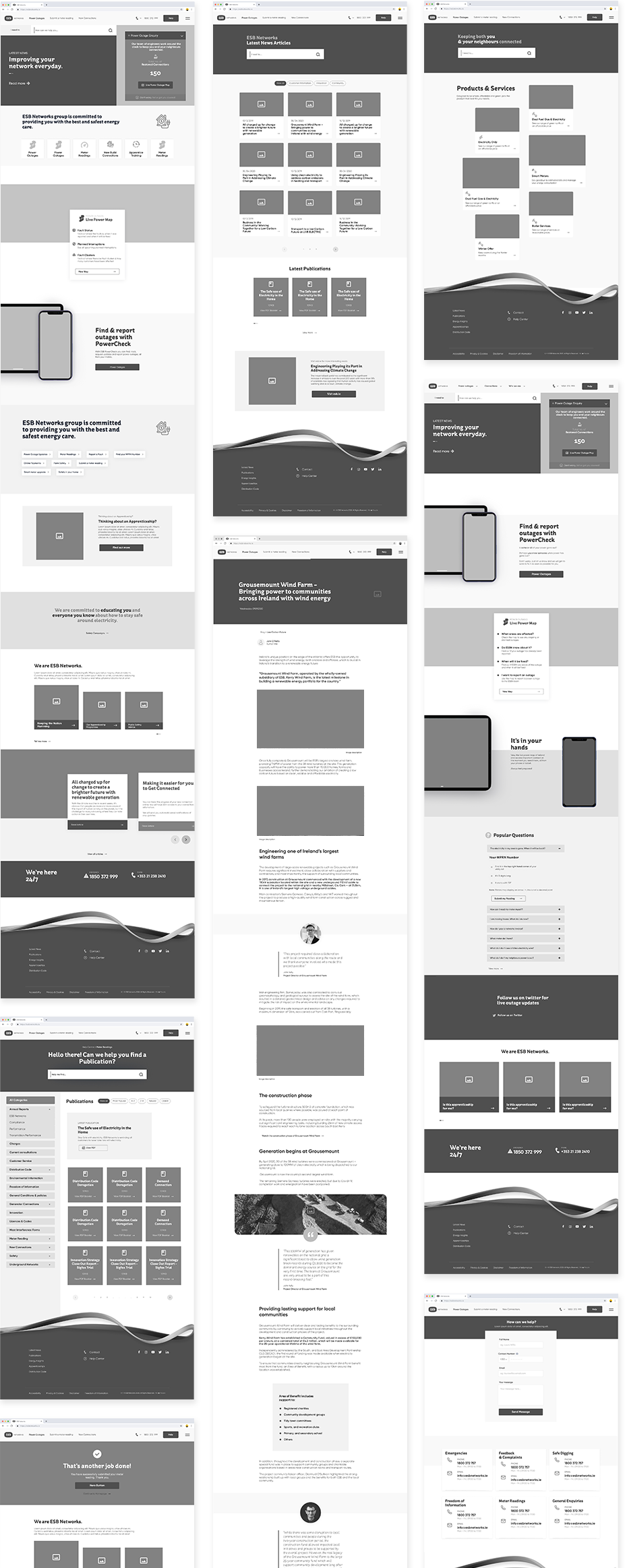
Working with rapid prototyping and low fidelity wireframes we were able to explore and refine the entire platform. This allowed the team to define all of the elements and components that would be needed to provide users with an effortless and clear digital experience. Constant collaboration between the client, design team and developers was crucial in ensuring that the concept phase of LAB+ was not only effective, but cost-efficient and feasible.
Wireframes
03. LAB+ Dedicated Spaces
All Together.
As Well As Apart.
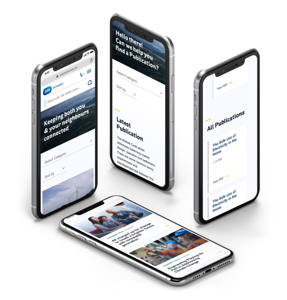
Early in the process we identified the need to enhance search results and help centre layouts. Our objective was to make the content quicker and easier to find, digest and recall. To achieve this we used content chunking methods, facilitated by mobile-first accordions to make content easier to scan, read and remember. Special focus was placed on navigation, filters, highlights and continuity.
Dermot O'Shea WONDRFew projects can provide tangible benefits to an entire nation. ESB Networks is one such website and we're very proud to have collaborated with the ESB team.
Founder
04. CRAFT The Design System
Maximum Detail.
Maximum Flexibility.
As part of the CRAFT stage, WONDR created a design system which is well structured and flexible at the same time. A variety of components was meticulously designed and selected to address any current and future needs. Modular and simple, it provides a solution that the business can flex as the need arises, with the confidence that accessibility and style consistency are ‘baked into’ the platform design.
Grid for Mobile
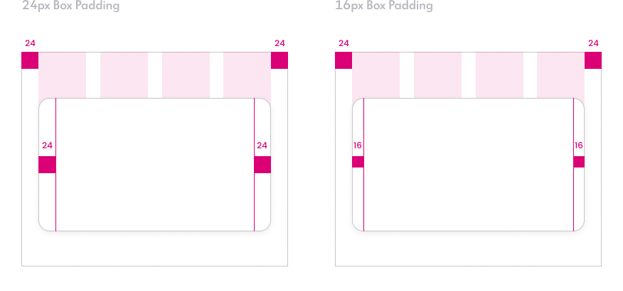
Grid for Desktop
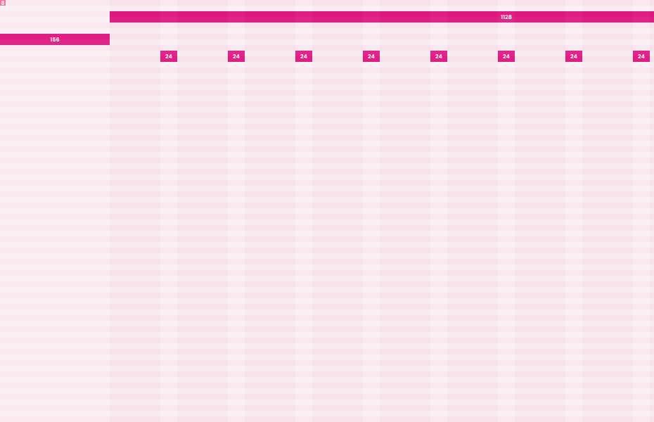
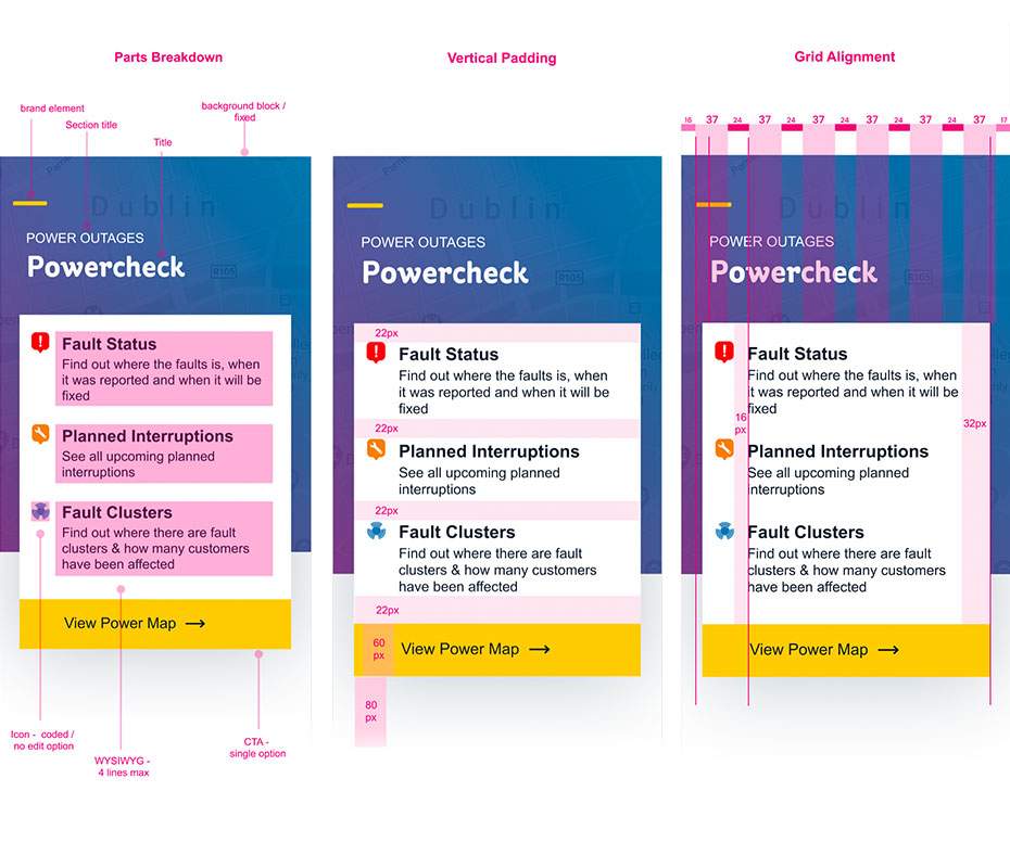
To ensure accuracy in build, WONDR delivered pixel perfect guidelines to the development team, facilitating an easy transition from design to build. Naturally, constant communication between the teams allowed for collaborative approach in which the needs of the end user were not lost in the technical delivery.
Developers Guidelines
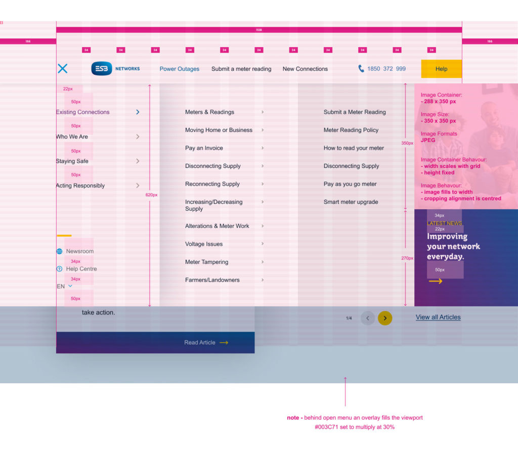
Megamenu
05. CRAFT Defining the User Interaction
Multiple Devices.
Singular Experience.
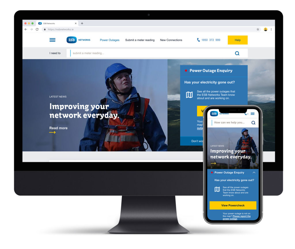
Customers interact with ESB Networks through many channels and devices, including web, mobile, and tablet. Understanding why and when users move from one channel to another helped WONDR to design smooth and consistently on-brand transitions.
06. Creating Cost-Effective Foundations
Singular Foundations.
Multiple Brands.
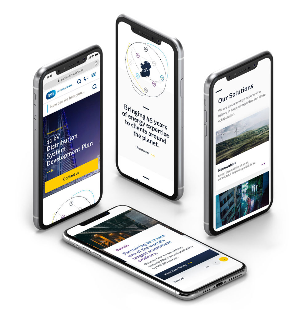
In order to benefit from economies of scale and create design consistency across ESB brands the designs and components for ESB Networks were quickly and efficiently tailored to serve the needs of ESB International and their branded digital presence. This approach accelerated the design, development and deployment of ESB International, with absolute confidence that their design, accessibility and technology foundations were inherited from a rigorously tested and reviewed source.
Find Out More
If you would like to learn more about the ESB Networks project or speak to us about a commission please contact:
_